

Large language models, generative artificial intelligence, neural networks, random forests, and deep learning.
All the grotesque buzz words that LinkedInfluences and python cultists throw at the wall anytime someone brings up statistics. It’s my God given right to laugh at people who say things like “let’s learn in the data” and accompany all of their bullet points with emojis. And I exercise that right, relentlessly, but I don’t feel very justified since I’m not well versed in the field of machine learning.
This project is a mash-up of three things I’ve been needing to do:
-
Walk through the history of machine learning models
-
Finally read Elements of Statistical Learning
-
Make enemies/develop rivals
I don’t have the patience to sit in a classroom when it comes to this topic. I have no real desire to study it. Big Data pisses me off because it’s primarily an effort in cleaning data (not my job) and adjusting for the fact that every other entry is a mismeasurement (not my fault this time). My money (research hours, I’m not a very successful consultant) is invested in small data and that’s not going to change anytime soon.
That said, it’s important stuff to learn so I guess I’ll just do it in public. For fun.
Today we being with Elements of Statistical Learning (we’ll call it Elements from now on) because I woke up at 5 AM, saw a non-satirical post about Chat-GPT having a 4-digit IQ, and it needs to be someone else’s problem now.
When I first started trying to break into the quant industry I was targeting machine learning and AI. I’ll say one thing positive about the data science scene, they don’t pedal certs the way that cybersecurity does; the majority of the field is big on freely accessible knowledge. The problem is that the organization of knowledge is borderline incoherent.
(Hopefully) That isn’t anyone in particular’s fault. I truly believe the majority of the data science literature is the result of repeated simplifications of statistical literature overlayed with an unclear standard of qualification. I fully support simplifying the content to allow for more year trained professionals to enter the workforce. That said what the hell degree do you need to become a data scientist? Electrical engineering, business analytics, management information systems, computer science, mathematics, statistics, animal science, chemistry? What separates an analyst from a scientist? What do we do with the statisticians who understand and develop the models versus the engineers who can describe what the machine itself is doing?
I’m all for diversified backgrounds and low barriers to entry but we need something to better homogenize the skill sets. I don’t think someone referring to themselves as a “senior data analyst” or “deep learning expert” should be arguing that least squares is a machine learning algorithm. Likewise I don’t think students graduating from quantitative undergraduate programs should be incapable of explaining memory allocation. Also the math people need to be gatekept out of the industry harder (looking at you recruiters), they must pay for their sins.
This entire blog is technically satire by the way.
Gonna kill a flock with a pebble here:
- I need to get used to a data set I’m using an an example for my Biometrics II students.
The data is from the Framingham Heart Study (FHS) and I’m planning to do some wack stuff with it for that semester. It’s hard to do wack stuff when you aren’t intimately familiar with the data so here we grow.
- I want to showcase that supervised learning and machine learning are not the same.
I will remain hostile about this topic, it’s machine learning when it’s unsupervised. As I’m reading through Elements I’ll be working with some of the presented models, methods, and problems. The problem of the day is dimension reduction for linear regression.
- I’m fairly certain I don’t need a package to do PCA
I saw something like 20 grad students last fall use random forests to perform PCA. I thought they were vibe coding but it turns out this was just standard practice in their labs, which horrifies me. I don’t like packages and I know thats a cooked take but PCA with forests is ridiculous. I think. I don’t know what PCA is but I’m pretty sure it’s a bunch of eigenvectors.
The cadance for this project is generally going to be “do it in R, do it in Python” because I want to showcase why Python sucks but I still have to get things done.
As always I’ll start by reading a .csv file because I’m really bad with unstructured data:
data = read.csv("data/framingham.csv")The data is comprised of 16 variables:
We’ll be classifying the male variable, which is 1 when the subject is male and 0 when they’re female.
I’m not a fan of arguing over the importance of variables, I tend to default to using as few as possible because I can’t think in hypercubes. But everyone wants to argue so we have things like LASSO and PCA when cDAGs are just as (if not more) effective and don’t need a single line of code to get there. I found the steps to do this through 4 different website because nobody wanted to finish the tweet for every step. Guess that’s my job too.
- Standardize each parameter of the data.
Regardless of whether we’re fitting the data as a design matrix we can’t use one here because the standardization step would just produce a column of NAs in place of the vector.
But I’m using lm(), because I’m not a silly goose, so no design matrix for me.
# there's some NAs i don't wanna deal withdata = na.omit(data)
# real easy to do this in Rst_data = scale(data[,-1])- Compute the covariance matrix for the standardized data.
# i like variance-covariance bc it's fun to say## but god it's confusing to new studentscov_data = cov(st_data)-
Calculate the eigenvalues and associated eigenvectors for the covariance matrix.
-
Sort the eigenvalues and their associated eigenvectors in descending order.
I’m pairing these up because R does both of these steps simultaneously:
# god this language is coolpca_data = eigen(cov_data)That’s it. Those are the principle components of the data. We’re not done with the analysis part but like what the hell? When is this going to become so difficult we need random forests?!
I’m adding some steps to this process because I don’t like insufficient detail in my algorithms.
- Calculate the proportional weight of each eigenvalue via .
This step is important and I don’t know why it isn’t mentioned more. The magnitude of each eigenvalue shows how important it is to the total variance of the data. If you want to capture of the data with your PCA you should have this vector of proportions to quickly determine which ones you need:
# im being dramatic it took me 20 minutes to find mention of this## but that's still 19 minutes too long in my opinionperc_var = pca_data$values/sum(pca_data$values) 0.21976874 0.11805973 0.10517030 0.07506606 0.07101639 0.06782681 0.06273542 0.05730788 0.05606409 0.05021246 0.03915418 0.02602203 0.02509558 0.01485218 0.01164816 When we add up the first 11 proportions we get of the variance captured, an amount most people wouldn’t push back against. We’ll mess with that later on.
- Build the feature vector from the chosen eigenvectors from step 5.
The decision rule of picking eigenvectors is arbitrary (I think) so I’m sticking with my 11. Also to call it a feature vector is just wrong but whatever man.
# for reference i wanted to do 4 vectorsfeatures = pca_data$vectors[,c(1:11)]# i like clean variable names at the endcolnames(features) = paste0("Comp",1:11)- Multiply the feature vector by the standardized data.
Everyone says “project the data” but we gotta cut that out. Assumed knowledge is fine but it’s literally “multiply these two things” we don’t need to save 5 seconds with vocab if it leaves out that much intuitive direction.
# this could vary depending on how you fucked up## your data structures. do the dimension math i guessfinal_data = as.data.frame(st_data %*% features)But wait, there’s more!
- Fit the finalized principle component data to a chosen model for your desired response.
But how will I accidentally gatekeep my industry if I don’t vaguely suggest that PCA requires a specific model?
I’m using linear regression. It works. Logistic regression works too. You can use other models, I promise.
# found out i can do this syntax to avoid## hand typing all the parameters### if it wasn't obvious i do small data, it is nowpca_m = lm(data$male ~ ., data = final_data)There’s. Still. More.
- Multiply the feature vector by the coefficients of the model
This is my general grievance with the inconsistency of data science media and knowledge sharing. I love open source education, keep it coming, but it’s really important to have a standard of practice. I’m not a bastion of quality SOPs for education— that’s why it’s really bad if I’m able to point out the flaws quickly.
Inference is really important to be able to do this profession. If I don’t know what the meaning of my results are then I can’t really claim to have done anything at all. Vague rules for reading graphs are perfectly fine as long as we’re willing to tell everyone how we got to the graph. We can still leave the act of developing more a detailed interpretation as an exercise for the reader.
# i like tables, what can i sayinfluence_table = data.frame(variable = colnames(data[,c(2:16)]), influence = features %*% coef(pca_m)[-1])
# base R plotting yESpar(mar = c(4, 8, 4, 2), bg="#9EA0A1") # never ggplotbarplot(influence_table$influence, names.arg = influence_table$variable, horiz = T, las = 1, cex.names = 0.9)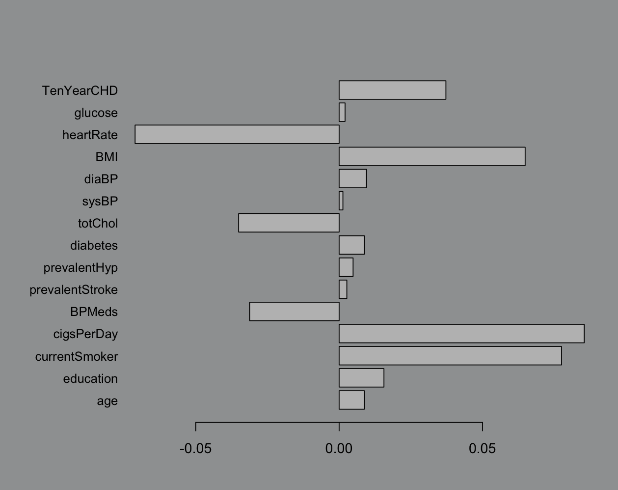
I know that the industry standard is a heatmap but we’re doing bar charts right now. This is pretty easy to work with, not very rigorous (possibly just confidently wrong) but we like easy. Big bar = pick that variable.
The reason I used linear regression instead of logistic is because sometimes it really doesn’t matter. Here’s the logistic fit:
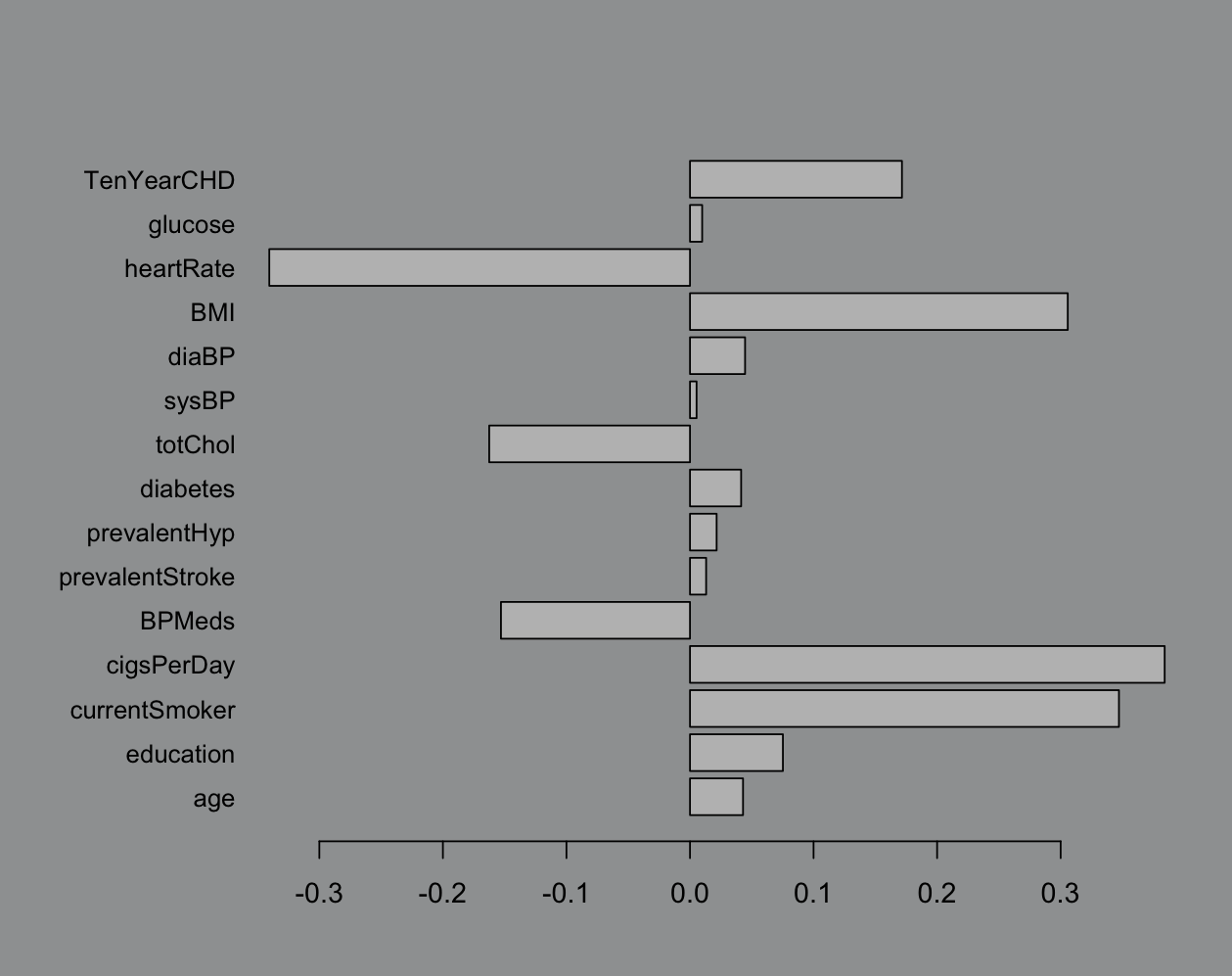
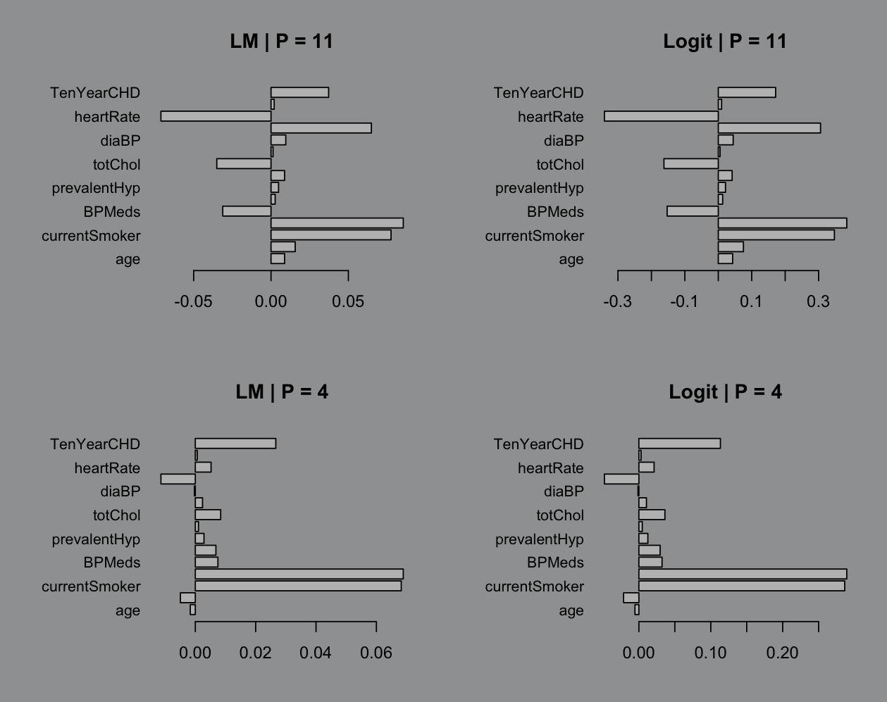
Like ya it matters but does it? Eh? The best part is when we start tossing in less than 11 variables. I don’t see the point in doing dimension reduction if we’re not getting something out it and 5 less variables barely seems worth the energy:
We can’t be so obsessed with perfection while we lean back and pretentiously say “All models are wrong”. Inaccuracies are fine as long as we can quantify them. Which is where we get to, in my opinion, a pretty cool final act:
- Fit a model to your selected variables.
# i still think this is too manym1 = lm(male ~ cigsPerDay + currentSmoker + heartRate + BMI, data = data)
# this is the most i could justifym2 = lm(male ~ cigsPerDay + currentSmoker + heartRate + BMI + TenYearCHD + totChol + BPMeds + education, data = data)This is getting long so I’ll toss my plot code at the bottom. Feel free to browse if you like base R plotting. The key points I want to stress here are (1) more predictors isn’t really helping and (2) uncertainty quantification is a really nice thing that linear regression always brings to the table:
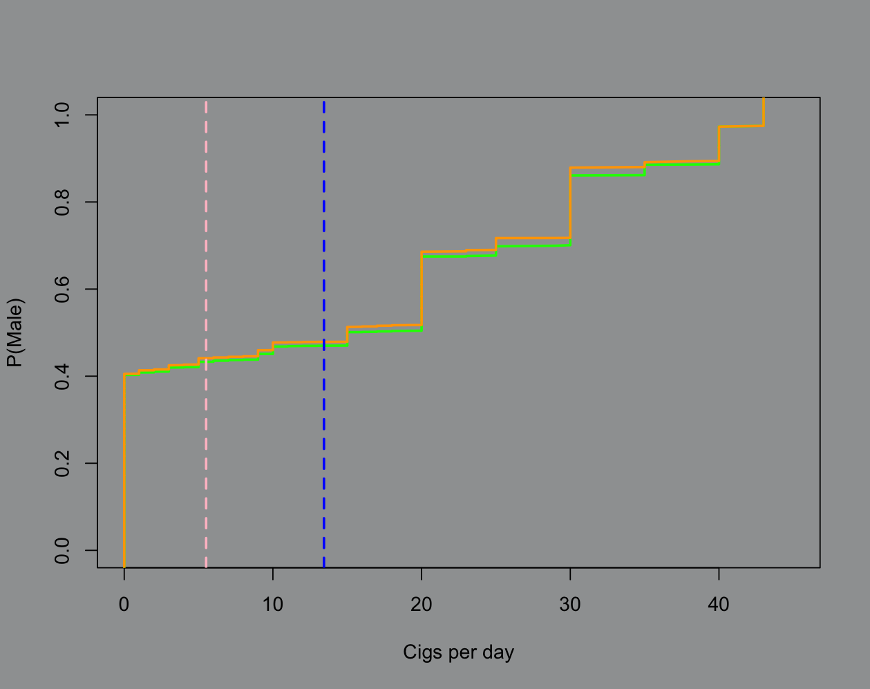
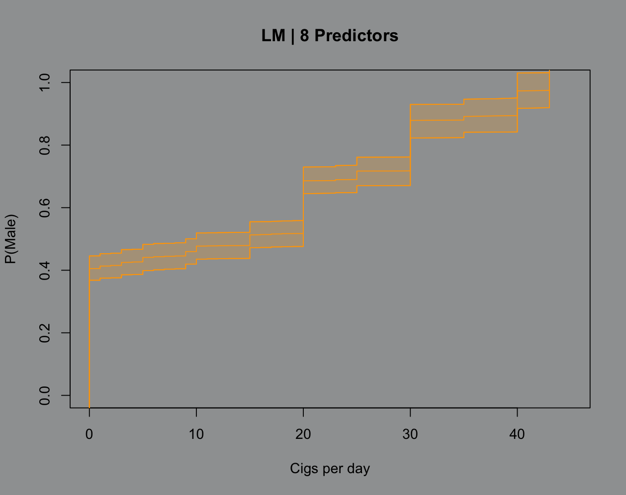
The green line represents the 4 predictor model and the orange is 8 predictors. The blue line is the male average cigarette count and the pink is female. The model isn’t very smart, in fact it’s misclassifying a good chunk of the real data. But we can see the rationale the model is using and write it out by hand (see: squared loss). If I were to visualize 1 standard deviation from each mean we’d see that the spread in male smoking habits for this data is pretty egregious, hence the model’s “behavior” around classifying.
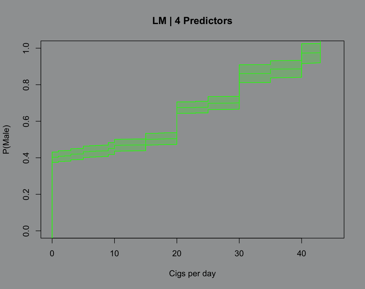
That part about uncertainty quantification is really cool because there’s no hoops to jump through for a good ol’ fashioned confidence band here:
That’s that for now. I’m gonna cap this off with the Python code and prep my lectures for tomorrow, we’re learning distribution theory (delicious).
Python code
# i don't like libraries# maybe thats why i hate python# everythings a god damn libraryimport numpy as nyimport pandas as pa # because it upsets you
# pull variable nameswith open("framingham.csv") as dat: var_names = dat.readline().strip().split(',')
# import datadata = ny.genfromtxt("framingham.csv", delimiter=",", skip_header=1, dtype=float, missing_values="NA", filling_values=ny.nan)
data = data[~ny.isnan(data).any(axis=1)] # remove NAs
y = data[:, 0] # responseX = data[:, 1:] # predictors
# standardize the data# i will say this is easier to do raw dog with python# im not *excellent* as apply in Rst_data = (X - X.mean(axis=0)) / X.std(axis=0, ddof=1)
# covariance of the standardized datacov_data = ny.cov(st_data, rowvar=False, ddof=1)
# compute eigenvalues/vectorslam, V = ny.linalg.eigh(cov_data)idx = ny.argsort(lam)[::-1] # sorting indexlam = lam[idx] # sort valuesV = V[:, idx] # sort vectors
# proportion vectorsperc_var = lam / lam.sum()print(perc_var[:11].sum())
# feature vectorfeatures = V[:, :11]
# standardized data * feature vectorfinal_data = st_data @ features
# design matrix built from final datadX = ny.column_stack([ny.ones(len(y)), final_data])
# i did lie to you all# i didn't fit linear regression to PCA before# it was just ols, but i don't like sklearns ols# because it has a bunch of fucking bells and whistles# i dont need right nowbhat = ny.linalg.inv(dX.T @ dX) @ dX.T @ y
# build the influence tableinfluence = features @ bhat[1:]varnames = var_names[1:16]
# so they're jacked up but i think its because# numpy uses a different eigen decomp# because these are proportionally similar to the R resultsinfluence_table = pa.DataFrame({"variable": varnames, "influence": influence})print(influence_table)Plot codes
m1 = lm(male ~ cigsPerDay + currentSmoker + heartRate + BMI, data = data)m2 = lm(male ~ cigsPerDay + currentSmoker + heartRate + BMI + TenYearCHD + totChol + BPMeds + education, data = data)
par(bg="#9EA0A1")plot(data$cigsPerDay,data$male,type="n", xlim=c(0,45), xlab = "Cigs per day", ylab = "P(Male)")points(sort(data$cigsPerDay),sort(predict(m1)),type="l",lwd=2,col="#00FF00")points(sort(data$cigsPerDay),sort(predict(m2)),type="l",lwd=2,col="#FFA500")abline(v=mean(male$cigsPerDay),col="blue",lwd=2,lty=2)abline(v=mean(female$cigsPerDay),col="pink",lwd=2,lty=2)
# i use a standard shell for confidence/prediction intervals# in base R, so i tend to just force everything into its formatsX = sort(data$cigsPerDay)sY = sort(data$male)
ci_m1 = predict(m1,interval="confidence")sci_m1=matrix(c(sort(ci_m1[,1]), sort(ci_m1[,2]), sort(ci_m1[,3])),ncol=3)
ci_m2 = predict(m2,interval="confidence")sci_m2=matrix(c(sort(ci_m2[,1]), sort(ci_m2[,2]), sort(ci_m2[,3])),ncol=3)
par(bg="#9EA0A1")plot(sX,sY,type="n",xlim=c(0,45), xlab = "Cigs per day", ylab = "P(Male)", main = "LM | 4 Predictors")points(sX,sci_m1[,1],type="l",col="#00FF00")points(sX,sci_m1[,3],type="l",col="#00FF00")points(sX,sci_m1[,2],type="l",col="#00FF00")polygon(c(sX,rev(sX)),c(sci_m1[,3],rev(sci_m1[,2])), col="#00FF0030",border="#00FF00")
par(bg="#9EA0A1")plot(sX,sY,type="n",xlim=c(0,45), xlab = "Cigs per day", ylab = "P(Male)", main = "LM | 8 Predictors")points(sX,sci_m2[,1],type="l",col="#FFA500")points(sX,sci_m2[,3],type="l",col="#FFA500")points(sX,sci_m2[,2],type="l",col="#FFA500")polygon(c(sX,rev(sX)),c(sci_m2[,3],rev(sci_m2[,2])), col="#FFA50030",border="#FFA500")